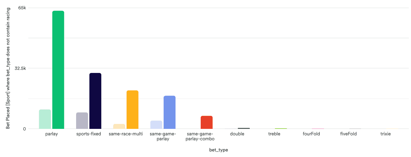
Optimising Home
Improving navigation and discoverability on the home screen to improve the experience and support commercial objectives.

Context
I had been tasked with redesigning the home screen so that it aligned with observed user objectives while also supporting key commercial objectives around increased usage of higher margin multi products.
My Role

Gathered insights from analytics, competitors and workshops to identify optimisations.

Defined opportunities that provided value to the user while driving commercial benefit.

Presented to senior stakeholders to secure buy in and roadmap prioritisation.
My Process
Status quo
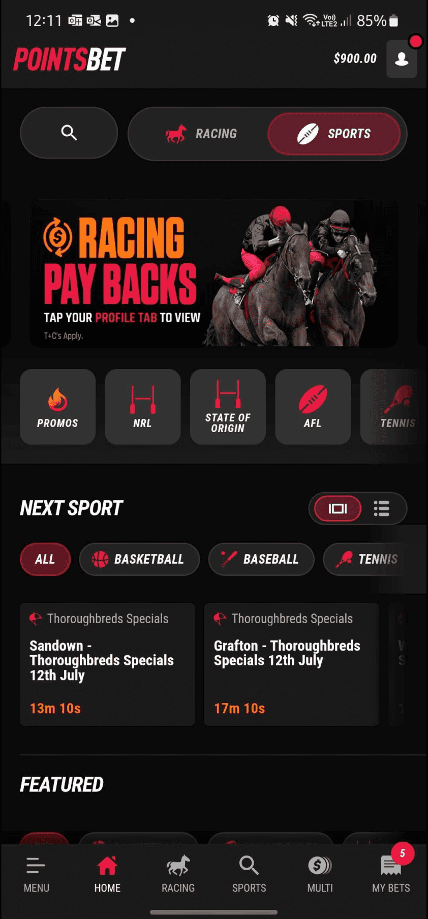
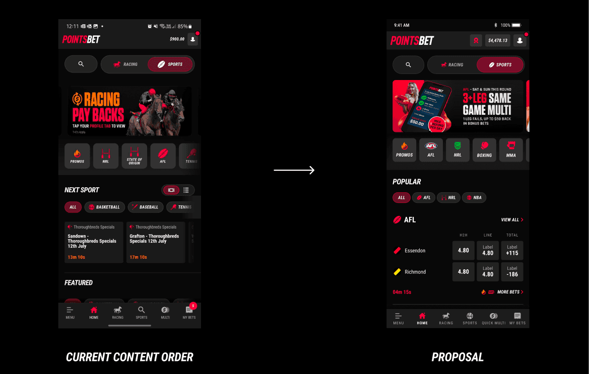
The current state of the home screen at the time of the project prioritise content in the following order:
- Promo and content banners
- Quicklinks
- Next Up sport carousel
- Featured Sport events (no apparent ordering logic)
Additionally, there was no representation of higher margin multi products on the home screen.
Insights
To understand how users were actually interactive with the home screen, I built an engagement map which captured all possible actions a user could take.
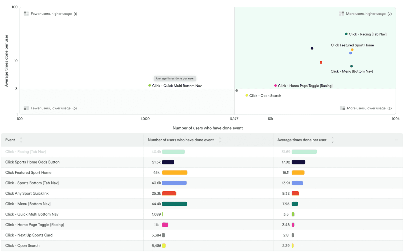
The top three actions were:
- Clicking on a featured sport:
45k users, 16 interactions p/u avg., ~724k total interactions. - Clicking on ‘Sports’ in the bottom nav:
43.6k users, 13.9 interactions p/u avg., ~606k total interactions. - Clicking on a featured sports odds button:
21.5k users, 17 interactions p/u avg., ~366k total interactions.
While the least common actions were:
- Clicking on ‘Quick Multi’ in the bottom nav:
1,089 users, 3.5 interactions p/u avg., ~3,812 total interactions. - Opening search (top of screen):
6,485 users, 2.3 interactions p/u avg., ~14.8k total interactions. - Clicking a ‘Next Up’ sport:
5,384 users, 2.8 interactions p/u avg., ~15.1k total interactions.
Problem definition
I used the project objectives and the insights to describe an addressable problem for the redesign:
The majority of visitors to the home screen are interested in featured/popular events however the "Featured" content list is random and unintuitive, introducing friction and effort to the journey. Additionally, "Next Up" events are prioritised despite being one of the least engaged with content types on the home screen.
Solution exploration
Contextual grouping and chronological ordering.
Introducing observable grouping and ordering to the featured list could support a reduction in time to discover, reduce friction and support faster conversion times.
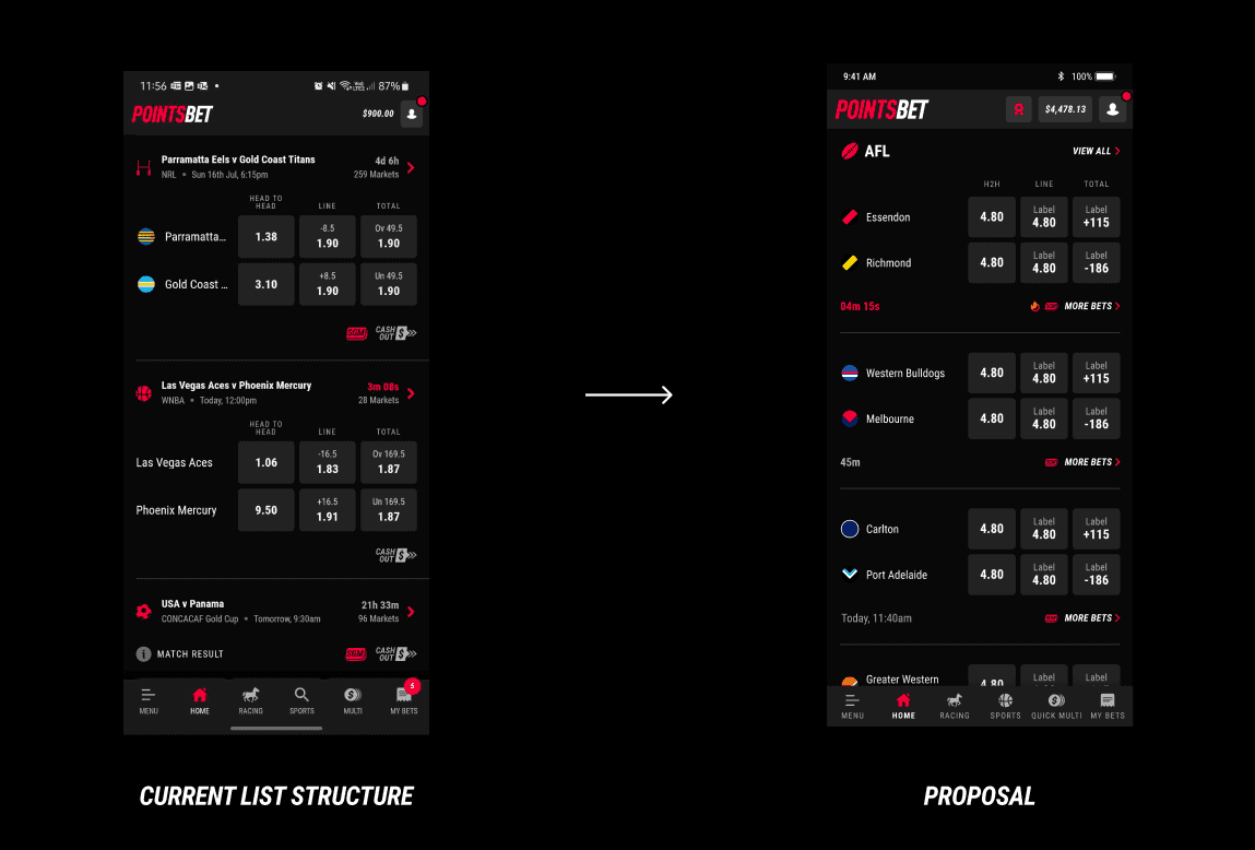
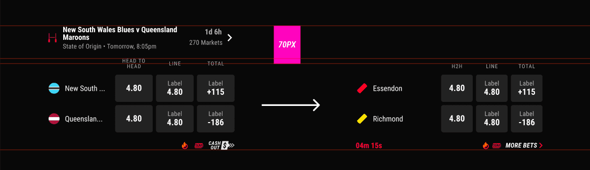
Refined list item UI.
With the introduction of contextual grouping, it was now possible to remove superfluous details affixed to the list item, winning back a significant amount of vertical on-screen real estate, reducing cognitive load and surfacing more events on screen.
Prioritising "Featured" content.
With the behavioural insights indicating a mass user preference for featured events, I rearranged the order of content to prioritise the "Featured" list of "Next Up"
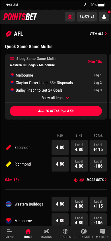
Surfacing high margin multis on home.
To support the commercial goal of increasing high margin multi engagement, I introduced a new component and wager type, "Quick Same Game Multis" to the home screen, within the competition groups.
Quick SGMs make it easy and fast for users to discover and place a same game multi due to the pre-built nature of the product and the surfacing of these wagers directly on the home screen within the related league or comp grouping.
The introduction of this product directly supports the commercial objective of increasing high margin multi engagement and makes it easier for a user to easily participate by eliminating cognitive load associated with manually building multis.
Proposed Success Metrics
To determine the success of the solution, I proposed the following metrics:
- An increase in conversion on featured events directly from home.
- A reduction in conversion time from the home screen to bet placement.
- An increase in high margin multi wager usage, aligned with commercial objectives.
Outcomes
Expected
- Odds button interactions on featured events from the home screen have increased by ~15.5%.
- Conversion time between viewing home and placing a bet reduced by 63.1% YoY.
- There was a YoY increase in sports bet conversion from the home screen of 5.9%.
- QSGM placement from home has received significant engagement (10.4k at the time of reporting).
Unexpected
- Clickthrough rates from the featured/popular events list has dropped off by 10.3%.
- The majority of QSGM placement happens away from the home screen.